Also working on the 2.0 version of my website, but its slow going. Webdesign was never my forté.
cheers,
Nick
all images in this blog are (c)2005-2009 Nick Egberts unless noted specifcally otherwise.
Follows the adventures of Nick Egberts in his quest to become an established Freelance illustrator.
+2005+Nick+Egberts+ava.jpg)


Also working on the 2.0 version of my website, but its slow going. Webdesign was never my forté.
cheers,
Nick
all images in this blog are (c)2005-2009 Nick Egberts unless noted specifcally otherwise.


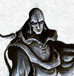
Various elements have changed as ye can see. I fixed the right arm becuase it looked like a club, I also changed the size and rendering of the wisps, mixing up the sizes to create more depth. This ofcourse has nothing to do with digital painting, I should have gotten it right the first time round. The lighting has become a whole lot more dramatic ofcourse, something i feel I can achieve a whole lot faster and better in photoshop. As a quick test it was more effective than I initially expected... I expect more tests like these in the future. Have to give a shout out to Ralph Horsley, I really like his aproach to acrylic painting, enough that I must be careful not to copy him...
I also talked about emulating Keith Thompson´s style as practice. This is the result:
 I dont like the resulting rendering too much. I did learn quite a few things about layers, and what you can achieve with areally tight pencil phase, as opposed to my customary loose scribbles. I did like the design of the bot, something I would have scrapped as too odd, if I never came across Keith´s work. He truly demonstrates the beauty of odd designs.
Still busy on the big piece, I talked about a couple of weeks ago. Almost ready to share some tasters with you guys. I am also busy studying the art of Keith Thompson. Visionary stuff, and his method seems very efficient, and is widely documented in a wide range of articles, dvd's and books.
-
all images in this blog are (c)2005-2009 Nick Egberts unless noted specifcally otherwise.

Nick Egberts - Everyone loved the humorous "horror" image. Gotta love the
expression on the Boll Deevil! Voted "Most Likely to win a Children's Book
Award"
I was well pleased with the end result, though the text Jon wrote got me wondering. I did approach the giant bug subject with a touch of mirth (the encapsulated dog and sleeping gown) and I always regarded my own style as stylised, textured, a bit whimsical perhaps, and quite detailed. I never tought "children's book suitable" though. I am sure a children's book publisher would never print said piece (in holland we might, we are quite odd), there is certainly a lesson to be learned here. People (and certainly AD's) look art a painting quite differently than it's maker does. I thought I already learned this, but the extent of it surprised me.
I need to keep this mind during my next project. It's gonna be a huge battle scene where five protagonists square off against a load of undead, while the sun is setting. i'll do it fully in photoshop, and its going to be about 14''x40". The idea is that it is supposed to be the crown to my sword n sorcery portfolio, after which Ill submit my work to the lovely folks at Wizard. I would be great if they were my first real clients. I dont believe in this hokey of starting with small €10,- gigs and slowly worming my way to the top. Drive and determination should prove just as useful!
That's all the self indulgent babble of the day folks, catch you all next week.
kind regards,
Nick
p.s. If you have the time check out the artorder blog next tuesday (about noon Pacific time)for the results of the next concept compo.
all images in this blog are (c)2005-2009 Nick Egberts unless noted specifcally otherwise.
 I finished this in about one work day. Very fast, for me at least. I've spent a couple of days in the country (Limburg, a (the only) hilly region of the Netherlands), which gave me tonnes of inspiration and motivation.. Illustrators spend a lot of time inside, and it easy to forget the energy the outdoors can bring.
Its 2009 people, its high time that we get affordable tablet laptops with a 20 hour batteries. Its bad enough that we dont have laser guns or flying cars....
Thats it for today, I am off enjoying the last bits of my dayjob holiday...
sincerely,
Nick
all images in this blog are (c)2005-2009 Nick Egberts unless noted specifcally otherwise.