+2005+Nick+Egberts+ava.jpg)

You know, writing e-mails is pretty hard work in my humble opinion, well enquiry e-mails at least. I have inmense trouble with gauging how i come across in text. Certainly because of the language barrier (i hail from the Netherlands). I like to think i can hold up a decent conversation in English, I also worked in the UK for a stint, which helps, but with written communication you just never know. With converstations, you can check people's bodylanguage for understanding and their pitch for their general mood. Maybe i should invest in a course in written English or something.
What is also causing me slight trouble is the fact that i am still unpublished, and quite unsure to try and hide it, or mention it clear in the initial email traffic. My gut feeling is stating it loud n clear, but when putting such bold thoughts to digital paper, It always seems to come out wrong. To AD's (or artists) reading this: any pointers are greatly apreciated. My own pointer to starting artists: Never send out emails at 2 am, tired over enthusiastic artist make stupid mistakes. I made a very emberassing one, that may well haunt me for a couple of years.
You'll be pleased to know that the ranting stops from this point onwards:
I have put some projects on hold (dont worry if you are a paying client this wont affect yoursI have far to little of you to start cancelling on ye) to practice my hybrid skills. Like I yapped about before, combining acryllic/watercolou paintings with digital overpainting seems to really be my schtick. The eventual goal is to create a method of painting that I am comfortable with, has the smoothness to apeal to a widerange of audiances but the texture and weight of a traditional painting. In effect using photoshop to speed up the difficlut elements of my beloved acrylic paintings.
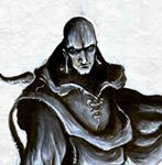
Pictured below is a new version of a painting I did two years before, and below that it´s previous incarnation.


Various elements have changed as ye can see. I fixed the right arm becuase it looked like a club, I also changed the size and rendering of the wisps, mixing up the sizes to create more depth. This ofcourse has nothing to do with digital painting, I should have gotten it right the first time round. The lighting has become a whole lot more dramatic ofcourse, something i feel I can achieve a whole lot faster and better in photoshop. As a quick test it was more effective than I initially expected... I expect more tests like these in the future. Have to give a shout out to Ralph Horsley, I really like his aproach to acrylic painting, enough that I must be careful not to copy him...
I also talked about emulating Keith Thompson´s style as practice. This is the result:
 I dont like the resulting rendering too much. I did learn quite a few things about layers, and what you can achieve with areally tight pencil phase, as opposed to my customary loose scribbles. I did like the design of the bot, something I would have scrapped as too odd, if I never came across Keith´s work. He truly demonstrates the beauty of odd designs.
 catch you all next time.
